Fujifilm Film Simulations Inspired by Christopher Nolan Films
For when your camera wants to think like a director.
Ever take a photo, look at the back of your camera, and think, “Wait… that could be a still from a Christopher Nolan movie”? The light feels sharper, the shadows are pulling extra weight, and suddenly the shot has more drama than you expected. You kind of sit there for a second like, “dang, I made art here.”
The tricky part is figuring out how to do it again. And if you nail the look, which movie does it actually line up with?
That’s where being a Fujifilm shooter gets fun. Our cameras let us build film simulations right in the body, so you can set the mood before you even press the shutter. No endless hours of grading later.
And yeah, Nolan has his trademarks, but his looks have changed over the years. Memento is cold and fractured. Inception is sleek and modern. Heck, even the Batman trilogy isn’t one note — Begins is gritty, Dark Knight is surgical, Rises leans big and harsh. He shifts tone with every story.
So I pulled together a set of film simulations — one per Nolan film — arranged in release order. Think of them as a chronological mood-map. For each, I’ll give you the synopsis (to remind you of the vibe), the color aesthetic (to anchor the look), the build (to replicate it), and some “everyday use” tips (so you know where it shines outside a movie set). The goal isn’t to cosplay a still frame — it’s to give you tools that carry the same kind of mood and texture. That way, when your camera decides to think like a director, you’ve already got the settings to back it up.
1. Following (1998)

Film Synopsis:
Before Nolan the blockbuster architect, there was Nolan the scrappy experimenter. Shot on weekends with friends, non-professional actors, and leftover film stock, Following is a taut little noir about a writer who follows strangers for inspiration and finds himself caught in webs of manipulation. On the surface it’s about crime and identity, but underneath it’s Nolan running stress tests on themes he’d revisit for decades: obsession, fractured perspective, the cost of curiosity. It’s rough, raw, and utterly compelling. Watching it now feels like opening a sketchbook and seeing the blueprint of a career already pulling toward complexity.
Color Grade Aesthetic:
Pure monochrome — not elegant, not polished, but unapologetically bare. The blacks are unforgiving, swallowing detail whole, while the whites push into overexposure. It’s closer to a Xerox copy of life than a glossy photograph. The aesthetic harks back to postwar noir but stripped of Hollywood sheen, giving you a version that feels DIY and immediate. That lack of smoothness becomes its strength — it tells you this isn’t about comfort or escapism, it’s about raw tension.
Simulation Build:
| Fujifilm Settings | Value |
|---|---|
| Film Simulation | Acros |
| Grain Effect | Weak |
| Highlight | +2 |
| Shadow | +4 |
| Sharpness | 0 |
| Clarity | -1 |
| Monochrome Color | N/A |
| WB | Auto |
| ISO | 800 |
| Exposure Compensation | -1/3 to -2/3 |
Film Simulation
Acros
Grain Effect
Weak
Highlight
+2
Shadow
+4
Sharpness
0
Clarity
-1
Monochrome Color
N/A
WB
Auto
ISO
800
Exposure Compensation
-1/3 to -2/3
Everyday Use:
Suited for street photography, shadowy corners, or stark portraits with no emotional filter. This one thrives in overcast light and concrete-heavy settings — where a cigarette and a lie might be just off-frame.
2. Memento (2000)
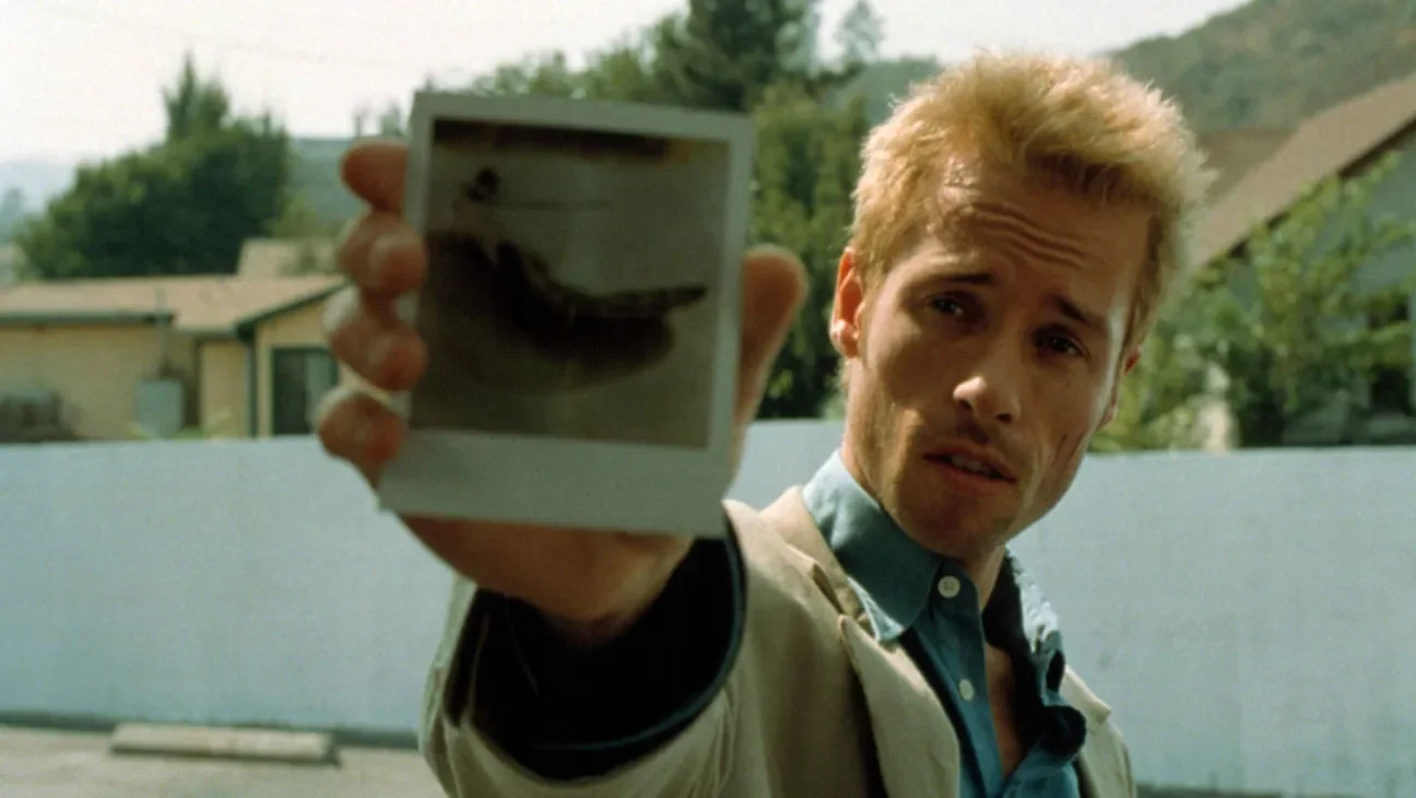
Film Synopsis:
Memento doesn’t just bend time, it rewires how you experience it. Leonard Shelby’s search for his wife’s killer is told in reverse order, so the audience shares his disorientation. Tattoos replace memory. Polaroids replace trust. Every scene makes you doubt the last, and by the end, you’re unsure whether you’ve solved anything at all — or if Leonard ever can. Watching it is like climbing a staircase that keeps reassembling behind you. It’s lean, relentless, and deeply human in its portrait of grief and denial.
Color Grade Aesthetic:
The split structure — desaturated color for the “present,” stark black-and-white for the “past” — isn’t just a gimmick. It mirrors Leonard’s mental fracture. The color feels cold and washed out, dominated by pallid blues and thin light, like a memory already fading. The black-and-white sections are harsh, binary, and clinical — fact versus fiction, yes versus no. But the trick is that neither side is trustworthy. The whole palette conspires to make you feel unmoored, like you’re grasping at truth but it keeps slipping into haze.
Simulation Build:
| Fujifilm Settings | Value |
|---|---|
| Film Simulation | Classic Chrome |
| Grain Effect | Weak |
| Highlight | +1 |
| Shadow | +3 |
| Color | -2 |
| Sharpness | +1 |
| Clarity | -3 |
| Color Chrome Effect | Strong |
| WB | Daylight, Shift: R: -1 / B: -3 |
| ISO | 640 |
| Exposure Compensation | 0 |
Film Simulation
Classic Chrome
Grain Effect
Weak
Highlight
+1
Shadow
+3
Color
-2
Sharpness
+1
Clarity
-3
Color Chrome Effect
Strong
WB
Daylight, Shift: R: -1 / B: -3
ISO
640
Exposure Compensation
0
Everyday Use:
Use for hard light, metal textures, and situations where emotional ambiguity is the vibe. It’s clinical, reserved, and great for scenes that feel like memory fragments.
3. Insomnia (2002)
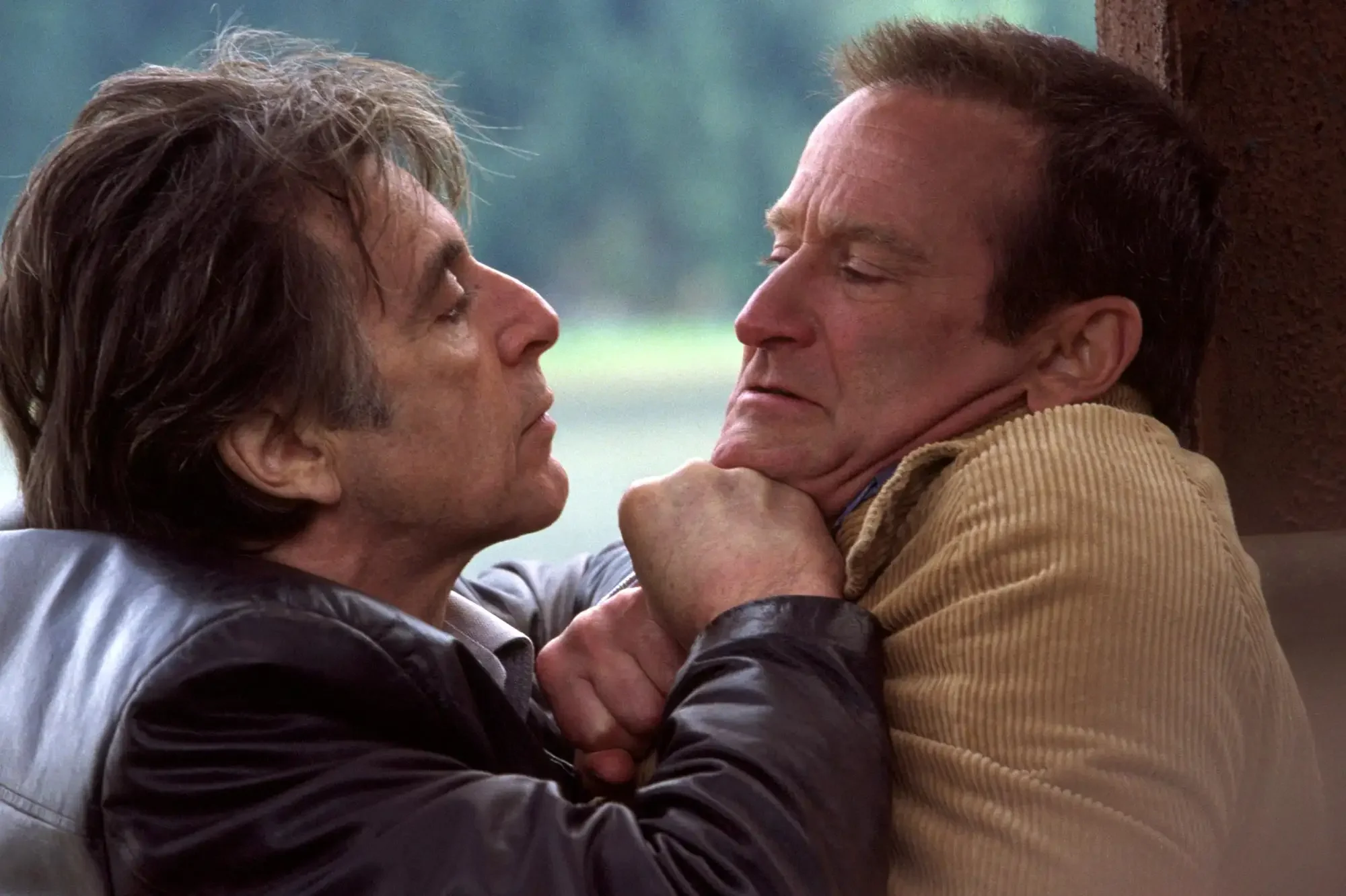
Film Synopsis:
In Alaska, where the sun never sets, Detective Will Dormer hunts a killer while battling his own unraveling conscience. Guilt, exhaustion, and hallucination blur the line between detective and suspect, predator and prey. The brilliance isn’t in jump scares or twists, but in the slow erosion of clarity — the way sleep deprivation makes every choice feel both urgent and suspect. With Pacino and Robin Williams circling each other in a dance of deceit, Nolan turns daylight into something oppressive, almost hostile.
Color Grade Aesthetic:
Instead of shadow, the film weaponizes light. Overcast skies and pale daylight feel drained, hazy, and unrelenting. Highlights bloom to the point of discomfort, washing scenes into exhaustion. Colors lean toward cold blues and washed-out grays, but never with crispness — everything has a softness, like the world itself has insomnia. It’s a palette that denies rest. You’re not comforted by brightness, you’re slowly suffocated by it.
Simulation Build:
| Fujifilm Settings | Value |
|---|---|
| Film Simulation | Eterna |
| Grain Effect | Off |
| Highlight | -2 |
| Shadow | 0 |
| Color | -3 |
| Sharpness | -1 |
| Clarity | -4 |
| Color Chrome FX | Weak |
| WB | Auto, Shift: R: -2 / B: -2 |
| ISO | 400 |
| Exposure Compensation | +1/3 |
Film Simulation
Eterna
Grain Effect
Off
Highlight
-2
Shadow
0
Color
-3
Sharpness
-1
Clarity
-4
Color Chrome FX
Weak
WB
Auto, Shift: R: -2 / B: -2
ISO
400
Exposure Compensation
+1/3
Everyday Use:
Perfect for grey skies, bleached fields, and environmental portraits where everything feels one step removed. It’s not dramatic — it’s quietly unnerving.
4. Batman Begins (2005)

Film Synopsis:
Forget spandex. Batman Begins rebuilt the superhero film as myth stripped of gloss. It’s not about gadgets or powers — it’s about trauma forged into purpose. Nolan drags Bruce Wayne through fear, discipline, and sacrifice, grounding his rise in martial rigor and a Gotham that feels less like fantasy and more like a city on the edge of collapse. Ninjas, corruption, and subway conspiracies intertwine, but at its core it’s about choosing identity over despair.
Color Grade Aesthetic:
Darkness reigns here, but not without texture. Blacks are crushed and heavy, swallowing edges, while shadows simmer with warm ochres and rust. Opposite them sit cold steel blues, a dual palette that suggests both the underworld grime of Gotham and the sharp edges of Wayne’s dual life. It’s tactile — you can almost smell the damp concrete and hear the buzz of flickering industrial lights. The look makes the city itself feel like a haunted machine.
Simulation Build:
| Fujifilm Settings | Value |
|---|---|
| Film Simulation | Classic Negative |
| Grain Effect | Strong |
| Highlight | 0 |
| Shadow | +4 |
| Color | -1 |
| Sharpness | +1 |
| Clarity | -2 |
| Color Chrome Effect | Strong |
| WB | Incandescent, Shift: R: +1 / B: -5 |
| ISO | 640 |
| Exposure Compensation | -2/3 |
Film Simulation
Classic Negative
Grain Effect
Strong
Highlight
0
Shadow
+4
Color
-1
Sharpness
+1
Clarity
-2
Color Chrome Effect
Strong
WB
Incandescent, Shift: R: +1 / B: -5
ISO
640
Exposure Compensation
-2/3
Everyday Use:
When you want to photograph like a city’s about to collapse. Use it for nighttime streets, industrial ruins, or portraits with a chip on their shoulder.
5. The Prestige (2006)
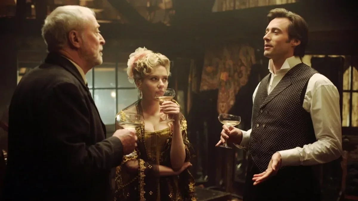
Film Synopsis:
Two magicians wage a war of obsession in turn-of-the-century London, escalating tricks into acts of cruelty. At first it feels like rivalry, but the deeper you go, the more it’s about sacrifice — what you’re willing to give up for greatness, and what that greatness really costs. With its clockwork structure and hidden doubles, the film itself is a magic trick: precise setup, escalating misdirection, devastating reveal. By the time the curtain falls, the obsession feels less like entertainment and more like haunting.
Color Grade Aesthetic:
The palette evokes Victorian nostalgia — warm ambers, muted golds, faded reds — but it’s never cozy. The warmth is fragile, almost brittle, like an old theater curtain that hides more than it reveals. Saturation is low, softness rules the frame, and the glow of candlelight is always undercut by shadow. Romantic at first glance, chilling on reflection. Color here isn’t beauty — it’s lure, masking the cold machinery of obsession beneath.
Simulation Build:
| Fujifilm Settings | Value |
|---|---|
| Film Simulation | Classic Chrome |
| Grain Effect | Strong |
| Highlight | -1 |
| Shadow | +2 |
| Color | -2 |
| Sharpness | 0 |
| Clarity | -3 |
| Color Chrome Effect | Weak |
| WB | Daylight, Shift: R: +3 / B: -1 |
| ISO | 800 |
| Exposure Compensation | 0 to +1/3 |
Film Simulation
Classic Chrome
Grain Effect
Strong
Highlight
-1
Shadow
+2
Color
-2
Sharpness
0
Clarity
-3
Color Chrome Effect
Weak
WB
Daylight, Shift: R: +3 / B: -1
ISO
800
Exposure Compensation
0 to +1/
Everyday Use:
Ideal for still-life portraits, smoke-filled rooms, old libraries, and any shoot that could plausibly involve a hidden trap door.
6. The Dark Knight (2008)

Film Synopsis:
This is less a sequel and more a crime saga disguised as a superhero film. Gotham becomes a battlefield of order versus chaos, with Batman, Gordon, and Dent pitted against the Joker’s unpredictable terror. The pacing is relentless, every scene pushing the moral lines further until the so-called heroes start compromising their own foundations. I still remember sitting in the theater four separate times, trying to breathe through the Joker’s “social experiment” scenes, feeling the air in the room lock up. This isn’t escapism — it’s confrontation.
Color Grade Aesthetic:
Crisp blacks, fluorescent undertones, and cool steel blues dominate the visual field. It’s cleaner and sharper than Begins, more urban, more clinical. Glass towers gleam like scalpel blades, and sodium-lit nights add sudden warmth that feels more threatening than comforting. The contrast is surgical: cold control splintered by bursts of chaotic fire. The aesthetic doesn’t just mirror Gotham — it makes you feel the Joker’s disruption cutting through a system that thought itself unshakable.
Simulation Build:
| Fujifilm Settings | Value |
|---|---|
| Film Simulation | Eterna Bleach Bypass |
| Grain Effect | Weak |
| Highlight | +1 |
| Shadow | +3 |
| Color | -2 |
| Sharpness | +2 |
| Clarity | -2 |
| Color Chrome Effect | Strong |
| WB | Fluorescent 2, Shift: R: -2 / B: -5 |
| ISO | 800 |
| Exposure Compensation | -1/3 |
Film Simulation
Eterna Bleach Bypass
Grain Effect
Weak
Highlight
+1
Shadow
+3
Color
-2
Sharpness
+2
Clarity
-2
Color Chrome Effect
Strong
WB
Fluorescent 2, Shift: R: -2 / B: -5
ISO
800
Exposure Compensation
-1/3
Everyday Use:
This sim thrives in harsh lighting, mirrored buildings, city nights, and noir-inspired portraits. Use it when your photo needs an edge — or when you want to pull emotion out of steel and concrete.
7. Inception (2010)
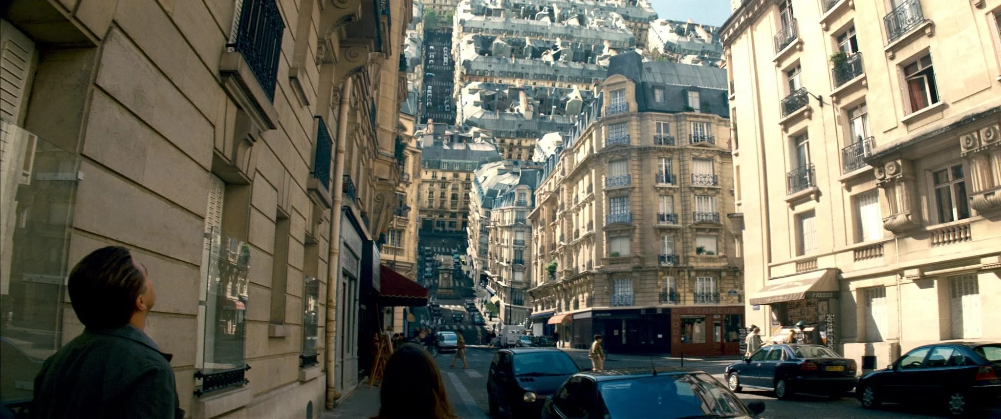
Film Synopsis:
Dreams within dreams within dreams. Cobb and his team dive into subconscious layers to plant an idea, but the deeper they go, the more reality frays. What starts as a slick heist film becomes a meditation on grief, guilt, and the weight of memory. I still remember sneaking my best friend into my basement to watch it in high school. We barely understood half the exposition and spent months dissecting the plot, but the feeling was undeniable — like someone had mapped out a new frontier in storytelling.
Color Grade Aesthetic:
The much-mocked teal-and-orange palette is here, but wielded with restraint. Cool shadows anchor the dreamscapes, while warm highlights sculpt faces and architecture without tipping into cliché. Contrast is strong but controlled — not hyperreal, but heightened, like a dream’s internal logic. The neutrality of Classic Chrome lets the teal/orange interplay land without losing realism, making every scene feel sleek, modern, and faintly uncanny.
Simulation Build:
| Fujifilm Settings | Value |
|---|---|
| Film Simulation | Classic Chrome |
| Grain Effect | Weak |
| Highlight | +1 |
| Shadow | +2 |
| Color | +1 |
| Sharpness | +1 |
| Clarity | 0 |
| Color Chrome Effect | Strong |
| WB | Auto, Shift: R: +2 / B: -3 |
| ISO | 800 |
| Exposure Compensation | 0 |
Film Simulation
Classic Chrome
Grain Effect
Weak
Highlight
+1
Shadow
+2
Color
+1
Sharpness
+1
Clarity
0
Color Chrome Effect
Strong
WB
Auto, Shift: R: +2 / B: -3
ISO
800
Exposure Compensation
0
Everyday Use:
Use this one when clean lines meet conceptual framing — skyline reflections, long exposures, interiors with strong geometry. It’s modern, confident, and slightly detached — like Cobb in a dream he can’t escape.
8. The Dark Knight Rises (2012)

Film Synopsis:
If Begins was about fear and The Dark Knight about chaos, Rises is about endurance. Gotham falls into siege under Bane, Bruce Wayne is broken in body and spirit, and the film drags him into literal darkness before clawing him back to light. This isn’t triumph handed over — it’s earned through pain, loss, and sheer will. There’s grandeur, yes, but also an undercurrent of exhaustion, like everyone — city included — is pushing through their last reserves.
Color Grade Aesthetic:
Visually, it blends the grit of Begins with the sharpness of Dark Knight, then drenches it in extremes. Snowy exteriors pale into cool blues, interiors glow with ochre and shadow, and outdoor set-pieces lean hard into blinding daylight. The contrasts are sharper, the swings more dramatic — collapse and rebirth fighting for dominance within the same frame. It’s epic in scale, but weighted with fatigue. I was tempted to say “copy and past ‘TDK’ here” and be done. Are they visually related? Absolutely. But Rises opens the aperture — more IMAX, more daylight, more environmental extremes — where TDK stays icier, tighter, and more nocturnal.
| Fujifilm Settings | Value |
|---|---|
| Film Simulation | Classic Negative |
| Grain Effect | Strong |
| Highlight | +2 |
| Shadow | +3 |
| Color | -2 |
| Sharpness | 0 |
| Clarity | -1 |
| Color Chrome Effect | Strong |
| WB | Auto, Shift: R: -1 / B: -4 |
| ISO | 800 |
| Exposure Compensation | 0 to -1/3 |
Film Simulation
Classic Negative
Grain Effect
Strong
Highlight
+2
Shadow
+3
Color
-2
Sharpness
0
Clarity
-1
Color Chrome Effect
Strong
WB
Auto, Shift: R: -1 / B: -4
ISO
800
Exposure Compensation
0 to -1/3
Everyday Use:
This sim thrives when you want to emphasize extremes — harsh daylight, snow or pale concrete, faces lit against warm interiors, or cityscapes that feel brittle and battle-worn. Perfect for winter street photography, construction zones, urban decay, or portraits where grit and endurance are the mood.
9. Interstellar (2014)

Film Synopsis:
Earth is dying, and a desperate gamble sends Cooper and a small crew through a wormhole in search of salvation. But at its heart, the film isn’t about space — it’s about the unbearable gravity of time and love. Years slip by in minutes, children grow old while parents stay young, and silence in the void becomes louder than any explosion. The science dazzles, yes, but the ache of separation is what leaves the lasting bruise.
Color Grade Aesthetic:
Muted earth tones on the farm, cold grays and blues in deep space, and carefully rationed warmth in human moments. The desaturation builds a sense of scale and emptiness, while density in shadows keeps the tone heavy. And then — sparingly — you get warmth: a child’s face, a golden sunset, the farmhouse at dusk. The contrast between cold cosmos and warm memory is deliberate, anchoring the story’s emotional weight.
Simulation Build:
| Fujifilm Settings | Value |
|---|---|
| Film Simulation | Eterna |
| Grain Effect | Off |
| Highlight | 0 |
| Shadow | +2 |
| Color | -2 |
| Sharpness | 0 |
| Clarity | -3 |
| Color Chrome Effect | Strong |
| WB | Daylight, Shift: R: -2 / B: -4 |
| ISO | 640 |
| Exposure Compensation | 0 to +1/3 |
Film Simulation
Eterna
Grain Effect
Off
Highlight
0
Shadow
+2
Color
-2
Sharpness
0
Clarity
-3
Color Chrome Effect
Strong
WB
Daylight, Shift: R: -2 / B: -4
ISO
640
Exposure Compensation
0 to +1/3
Everyday Use:
Shoot with this when you want stillness with scale — sunsets on empty roads, fog over fields, contemplative portraits against open skies. This one’s for emotional weight more than visual pop.
10. Dunkirk (2017)

Film Synopsis:
Nolan strips war down to its rawest form: survival. Told across three timelines — land, sea, and air — the film is nearly wordless, letting sound, image, and ticking time do the storytelling. It’s not about strategy or politics. It’s about the claustrophobia of a sinking ship, the panic of a stalled engine, the endless waiting on a beach that feels more like a trap. Watching it feels like your body’s been drafted into the evacuation — tense, breathless, on edge until the very last frame.
Color Grade Aesthetic:
The palette is drained of glamour. Cold blues, muted tans, and neutral grays dominate, while contrast is dialed high enough to make every detail sharp without slipping into stylization. Classic Chrome adds just enough desaturation to hint at age and memory, but it never romanticizes. The look feels documentary-level real — urgent, immediate, almost harsh in its refusal to soften the experience.
Simulation Build:
| Fujifilm Settings | Value |
|---|---|
| Film Simulation | Classic Chrome |
| Grain Effect | Strong |
| Highlight | +1 |
| Shadow | +3 |
| Color | -3 |
| Sharpness | +1 |
| Clarity | -2 |
| Color Chrome Effect | Weak |
| WB | Daylight, Shift: R: -3 / B: -4 |
| ISO | 800 |
| Exposure Compensation | 0 |
Film Simulation
Classic Chrome
Grain Effect
Strong
Highlight
+1
Shadow
+3
Color
-3
Sharpness
+1
Clarity
-2
Color Chrome Effect
Weak
WB
Daylight, Shift: R: -3 / B: -4
ISO
800
Exposure Compensation
0
Everyday Use:
Use this one for documentary-style realism — beach walks, history tours, foggy hillsides, or human-centered street photography. Every frame feels urgent but timeless.
11. Tenet (2020)

Film Synopsis:
Time doesn’t just move forward. It inverts, loops, collides with itself. A nameless Protagonist is thrown into a war where cause and effect are scrambled, and the stakes are nothing less than the survival of existence. Watching it is like standing inside a machine running forward and backward at the same time — overwhelming, hypnotic, and alienating in the best way. I saw it four times in theaters, not because I cracked it (still haven’t, fully), but because I couldn’t look away from the sheer audacity of its construction.
Color Grade Aesthetic:
This is Bleach Bypass 2.0. Clean separation, icy light, slate grays, and polished chrome tones dominate. Warmth is almost absent, which makes the entire aesthetic feel mechanical, precise, like architectural renderings come to life. Shadows stay deep, highlights run cool, and the whole frame carries the chill of inevitability. It’s sleek minimalism stretched across chaos.
Simulation Build:
| Fujifilm Settings | Value |
|---|---|
| Film Simulation | Eterna Bleach Bypass |
| Grain Effect | Off |
| Highlight | +2 |
| Shadow | +2 |
| Color | -2 |
| Sharpness | +2 |
| Clarity | -1 |
| Color Chrome Effect | Strong |
| WB | Fluorescent 1, Shift: R: -2 / B: -3 |
| ISO | 800 |
| Exposure Compensation | -1/3 |
Film Simulation
Eterna Bleach Bypass
Grain Effect
Off
Highlight
+2
Shadow
+2
Color
-2
Sharpness
+2
Clarity
-1
Color Chrome Effect
Strong
WB
Fluorescent 1, Shift: R: -2 / B: -3
ISO
800
Exposure Compensation
-1/3
Everyday Use:
Modern architecture. Empty airports. Cityscapes with repetition and symmetry. Great for minimalism and sleek design — or any shoot where entropy needs a clean aesthetic.
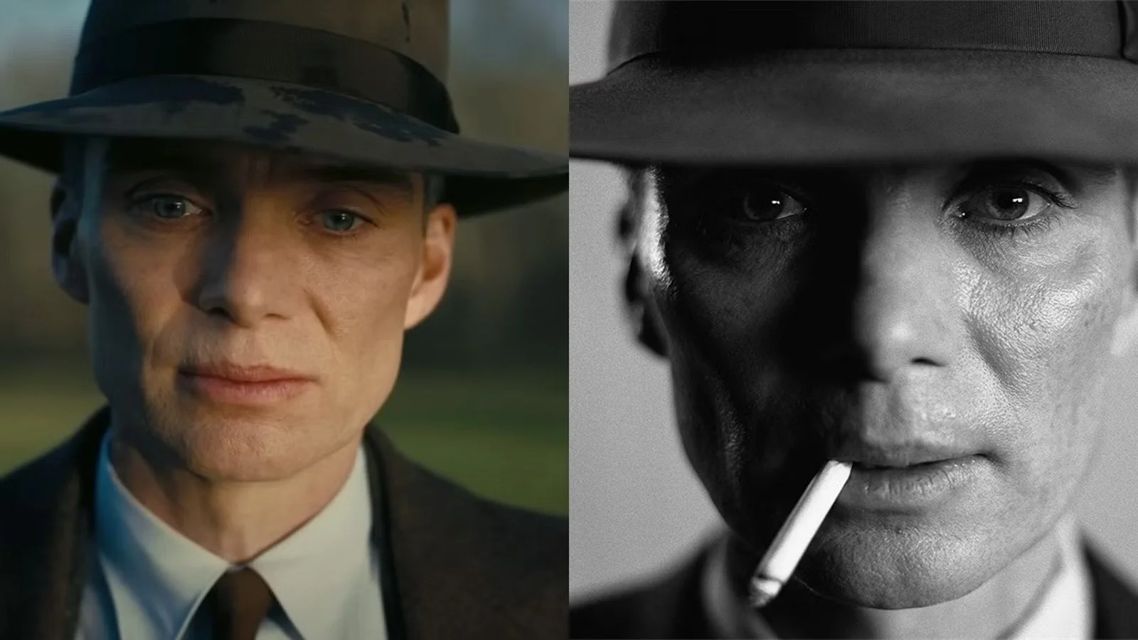
12. Oppenheimer (2023)
Film Synopsis:
A portrait of creation, destruction, and the unbearable weight of genius. J. Robert Oppenheimer’s life is told through fractured timelines, scientific breakthroughs, political hearings, personal betrayals, all circling the moral fallout of building the bomb. The film feels both intimate and cosmic, pulling you close to Oppenheimer’s doubts while never letting you escape the shadow of history. It’s lush and austere at once, ending not with catharsis but with quiet devastation.
Color Grade Aesthetic:
Split tonality defines the look. Warm, dusty hues for the human moments — browns, ambers, and soft light wrapping faces and rooms in fragile beauty. Then, stark black-and-white for the judgment sequences, rendered in IMAX with brutal clarity. Grain is intentional, texture is everything. It’s a painterly mix of warmth and austerity, like history itself being remembered and judged at the same time.
And guess what? We get a two-simulations-for-the-price-of-one here!
Color Simulation Build:
| Fujifilm Settings | Value |
|---|---|
| Film Simulation | Nostalgic Neg (or Classic Chrome if unavailable) |
| Grain Effect | Strong |
| Highlight | 0 |
| Shadow | +2 |
| Color | -1 |
| Sharpness | 0 |
| Clarity | -2 |
| Color Chrome Effect | Strong |
| WB | Auto, Shift: R: +1 / B: -2 |
| ISO | 640 |
| Exposure Compensation | 0 |
Film Simulation
Nostalgic Neg (or Classic Chrome if unavailable)
Grain Effect
Strong
Highlight
0
Shadow
+2
Color
-1
Sharpness
0
Clarity
-2
Color Chrome Effect
Strong
WB
Auto, Shift: R: +1 / B: -2
ISO
640
Exposure Compensation
0
Black & White Simulation Build:
| Fujifilm Settings | Value |
|---|---|
| Film Simulation | Acros + R Filter |
| Grain Effect | Strong |
| Highlight | +2 |
| Shadow | +4 |
| Sharpness | +1 |
| Clarity | -2 |
| Monochrome Color | N/A |
| WB | Auto |
| ISO | 800 |
| Exposure Compensation | -1/3 |
Film Simulation
Acros + R Filter
Grain Effect
Strong
Highlight
+2
Shadow
+4
Sharpness
+1
Clarity
-2
Monochrome Color
N/A
WB
Auto
ISO
800
Exposure Compensation
-1/3
Everyday Use: For the color version, this recipe enhances reflective storytelling scenes, especially in morning or dusk light. Think moody portraits, historic architecture, and autumn landscapes. The black-and-white version excels in formal portraits, documentary-style street photography, and any subject where emotional gravity and timelessness are key. The Acros + R filter is particularly effective for skies and faces, deepening shadows and emphasizing tonal drama.
Final Frame
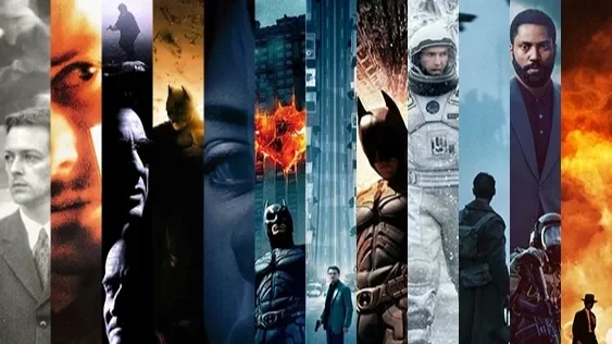
Christopher Nolan’s films have been landmarks in my life. I don’t say that lightly. I snuck my best friend into my parents’ basement to watch Inception because I couldn’t wait another day to share it. I saw The Dark Knight and Tenet in theaters four times each, dragging along anyone who’d come with me — not because I wanted company, but because I wanted to watch their faces when the weight of those stories landed. I’ve argued about Interstellar at two in the morning, quoting lines from Cooper and Murph while someone else shook their head and said, “It’s too sentimental.” And still I’ll defend it. Nolan isn’t background viewing for me. He’s part of how I see storytelling itself.
That’s why these Fujifilm simulations mean something more than “nice color recipes.” They’re not tricks to make a photo look cinematic. They’re tools for mood, precision instruments for tone. Each one carries an echo of the emotional current that Nolan threads into his films: fractured memory in Memento, moral collapse in The Dark Knight, endurance and rebirth in The Dark Knight Rises, the unbearable gravity of time in Interstellar. You don’t need to recreate the exact look of Wally Pfister or Hoyte van Hoytema to feel it. What matters is aligning your own intent with that same discipline of tone.
Because here’s the real magic: cinematic photography doesn’t start with LUTs or post-production software. It starts the moment you decide how you want your image to feel. Do you want it to unnerve? To soothe? To haunt? To ignite? These simulations are shortcuts to those moods, yes, but more importantly they’re reminders that tone is a choice. Nolan makes his choices deliberately, ruthlessly, with total control. With the right sim dialed in, you can practice that same intentionality in your own frame — whether you’re shooting a skyline, a stranger on the street, or your kid’s soccer game.
And if you’re already a Fujifilm shooter, film sims are second nature. You probably already have your everyday go-tos. Think of these Nolan builds as an expansion pack — a thematic toolkit. They won’t replace your core recipes. They’ll sit beside them, waiting for the days when you want your camera to feel less like a tool and more like a co-conspirator in mood.
So go ahead — channel Gotham’s steel blues, or the dusty amber of a Midwestern farm, or the split black-and-white judgment of Oppenheimer’s testimony. Let your photos feel like stories. Let them carry weight. Let them make someone pause the way Nolan films have made us pause for decades.
And if you're already using film simulations as part of your everyday flow? Consider these Nolan-inspired builds a thematic expansion pack. A way to shoot not just what you see, but what your shot feels like it should mean!